Rocket brand (1.0 - 2018)
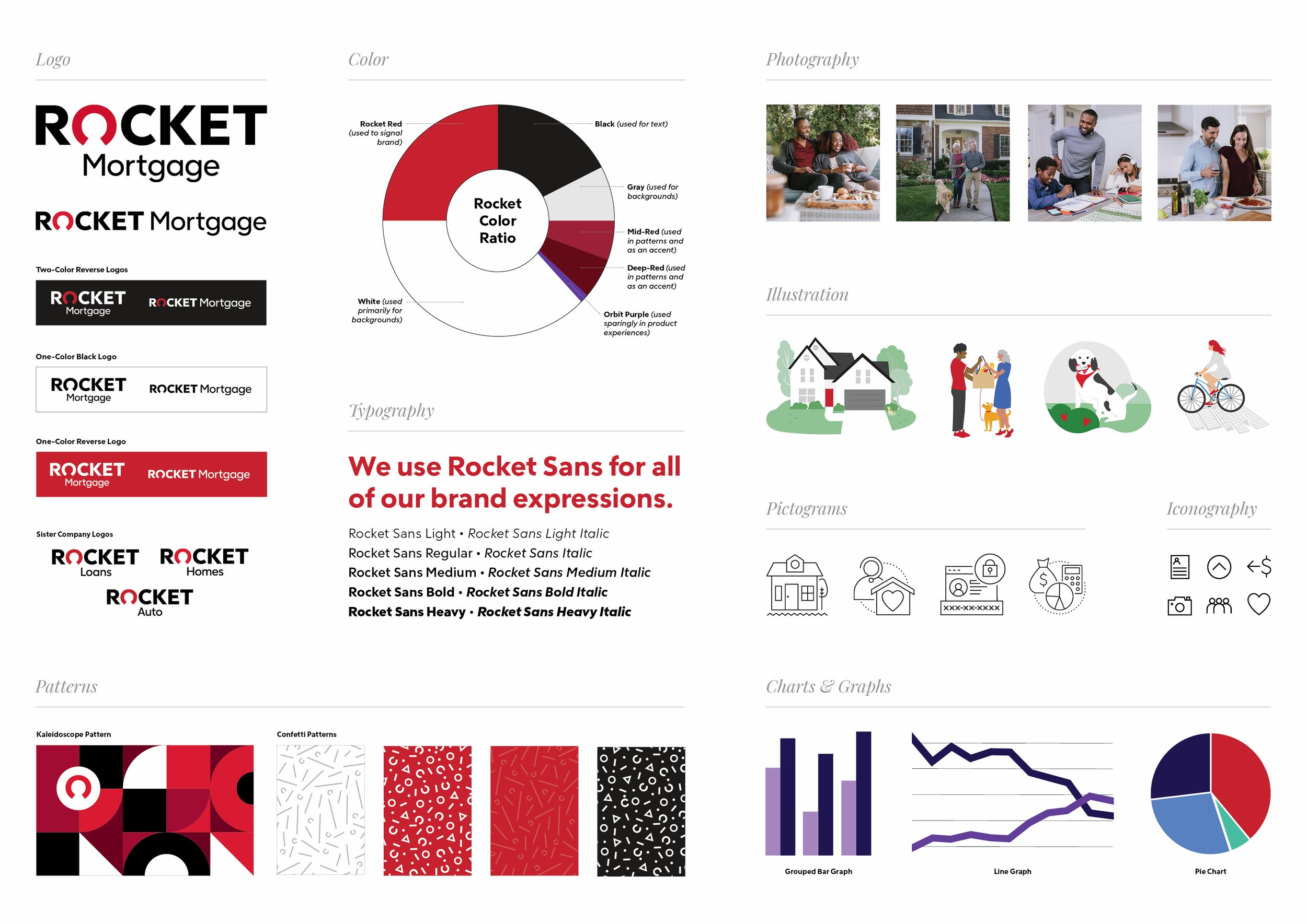
In 2018, we worked with the creative brand agency Lippincott to develop the new brand identity system for Rocket. Lippincott set the foundation for Rocket’s new brand identity. My team worked to expand upon it, evolve it and eventually evangelize it with our 15,000+ team members, as well as our clients. The goal was to create a cohesive visual system that would inspire irrational passion for the brand.
We developed a creative system of assets including pictograms, illustrations, patterns and creative ways to apply our signature “Rocket O,” that could flex, depending on audience, but still look consistent.







a custom typeface
Rocket Sans was created exclusively for Rocket Companies. An enterprise-wide proprietary typeface eliminated the legal side of licensing many fonts. We distributed the font across the organization to be used in every possible application. It is crisp, modern and designed to be approachable without sacrificing legibility.
The mix of hard and soft forms within Rocket Sans informs many of our design system assets - we strive to express boldness with humanity.
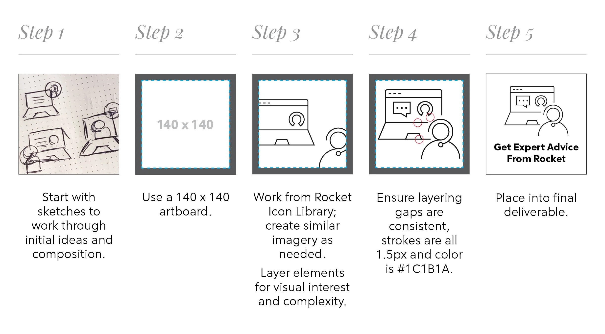
pictogram creation
In my role on the Brand Management team at Rocket, I developed the pictogram language and fulfilled requests for pictograms. They were meant to bridge the gap between a grand illustration or functional icon in all types of creative experiences or assets. They communicate a more complex idea than an icon and provide visual support in moments that wouldn’t be appropriate for an illustration.
Shapes within pictograms are simple, constructed of strokes, derived from icons and are intended to complement Rocket Sans.

